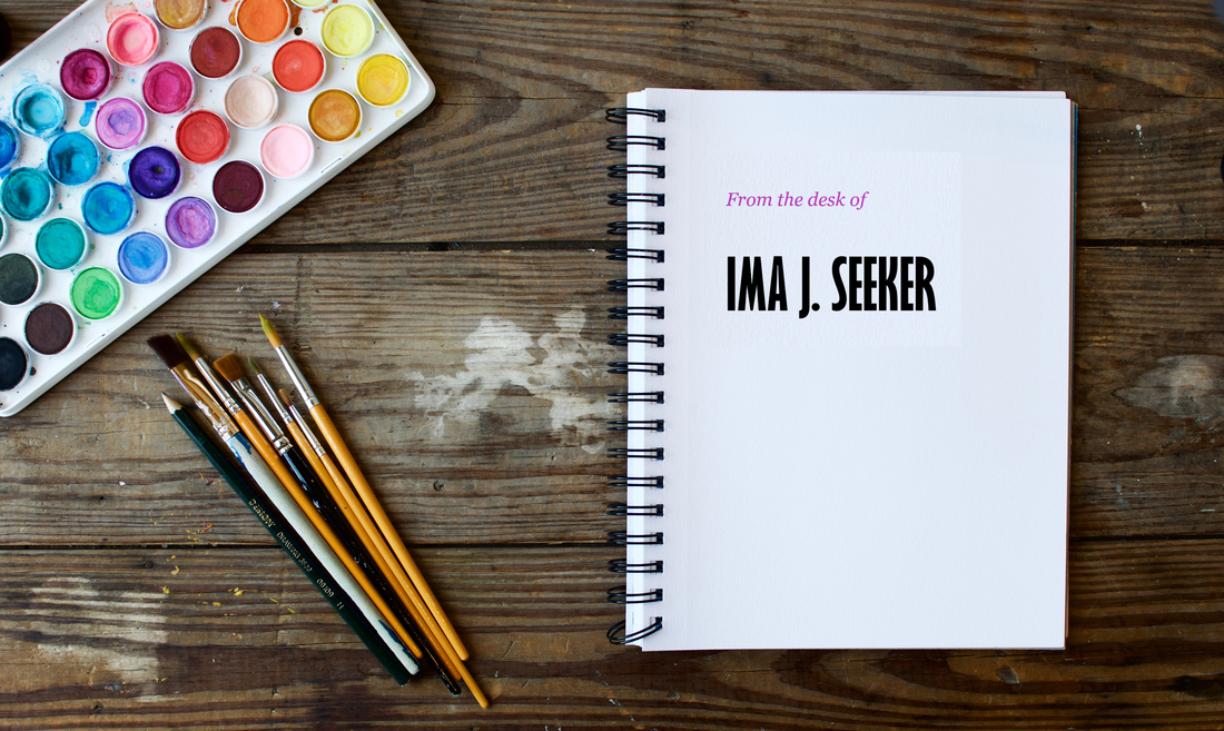
 Establishing Your Personal Brand Through Stationery, Part 2In Part 1 of this post, I talked about the things you should include or consider including in your letterhead. As I say in Part 1, you don’t have to be a design professional to establish a sleek theme for your correspondence. In Part 2, I get into the particulars of how you can design your letterhead. If you are a design professional, you are arguably leagues beyond the guidance I provide here. If you are not a designer, but you want to capitalize on whatever points you can gain by putting together a smart design in your personal branding without busting out advanced design techniques or tools, then keep reading. How to Design LetterheadYou can put together a simple, sleek letterhead by carefully choosing your fonts, their sizes, and color. FontsSerif vs. Sans Serif Fonts. In the world of typefaces, there are serif fonts, and sans serif fonts. Oxford tells us that a serif is “a slight projection finishing off a stroke of a letter in certain typefaces.” As a result, serif fonts are those that have serifs in the detailing on the letters, and sans serif fonts do not. Lots of fonts from both families make for great choices in your personal branding and stationery. The question of which style is right for you is a matter of what’s professional, what you like, and the sorts of fonts that may be typical for certain industries (and whether you want your materials to follow suit with those trends). If you are struggling to picture the difference, take a look at these. This is a header using the serif font Georgia: 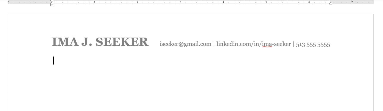 This is letterhead with a serif font called Georgia. Here is an example of a letter head that uses a sans-serif font called Gill Sans MT: 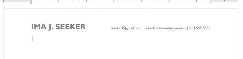 This is letterhead with a sans-serif font called Gill Sans MT. Pairing Fonts. You may prefer or choose to stick with one font, which is a perfectly fine choice (that keeps things streamlined). But, if you are looking to spruce up your stuff and give it a fresh look and feel, you should consider pairing two or even three fonts strategically. Here is a combination of Gill Sans MT in the person’s name and Georgia in the contact information: 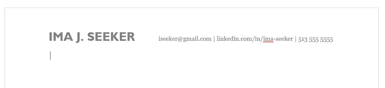 This is letterhead with a combination of a sans-serif font called Gill Sans MT for the person's name, and serif font called Georgia for this person's contact information. One of the keys to pairing fonts together is contrast. You want to find fonts that complement one another but that are distinct enough from one another that you can easily tell them apart. I bring up the difference in serif and sans serif fonts because the presence of serifs in one typeface and the absence of them in the other is an easy way to guarantee that you are working with more distinct fonts. You can pair serifs with other serif fonts and sans serifs with other sans serifs, but if you are new choosing fonts, I would stick with pairing a sans serif to a serif. I recommend sans serifs for your name and headers and serifs for your paragraph-level text, or vice versa. When I say you might be able to do three fonts, I mean that you might choose a third font for your name, and then apply the same rule of one style of font to your headers, and the other style of font to your paragraph-level text. Note, for example, that my website uses the script font (script meaning that it looks as if it were handwritten) Journal for my company name. After that, I use a sans serif font called Lato for headers and sub headers, and I use a serif font called Garamond for paragraph text. If this is well outside of your wheelhouse, and you don’t think you have the eye for it, take comfort in the knowledge that this is something you can Google. Type in a query like, What font combinations work well on resumes? Or, What fonts match well together? A bunch of suggestions will pop up. Look around, and try out a few combinations that you like. If this is well outside of your wheelhouse, and you don’t think you have the eye for it, take comfort in the knowledge that this is something you can Google. Font Tip: Stick with Microsoft DefaultsIf you decide to spruce up your stationery with new fonts, I recommend sticking with fonts that are default options with Microsoft. Why? If you send Word documents in for job applications, you want the recruiter to be able to see the fonts you selected. If you use a font that you purchased or downloaded and added to Microsoft, you run the risk that the reader of your document doesn’t have those fonts loaded into Word. The result is that Microsoft switches the font you so carefully selected to a default font that Microsoft has, and it might not be pretty. The default font might not fit on your page the same way, completely wrecking the formatting and overall look and feel of your materials. If you stick with fonts that Microsoft already has, you are increasing the likelihood that your materials look the way they should when the recipient looks at them. You can also save your Word documents as PDFs to preserve their look and feel, but some application portals may require you to submit Word documents. Font SizesUse a hierarchy for sizing your information. Something else I see quite often on client materials is the use of the same size font throughout the entire resume or cover letter. Let me tell you — one size does not fit all! You want your name, for instance, to be nice and large in the header so the reader can see it easily. Nothing else in your branding should be as big as your name, which again essentially is your logo. Making the pieces of your correspondence different sizes from one another is partly how you can draw the reader’s eyes to items of importance. You want your name to be in the biggest size, and how big you make the font depends on the font you choose, the length of your name, etc. It could easily be size 20, or maybe larger or smaller, depending. You want your headers larger than sub headers, and all levels of header should be larger than the font at the paragraph or text level, which should be no smaller than size 10, but preferably size 11 or 12. This stuff mostly applies to resumes, memos, and other forms of correspondence where you may have headers. Let me tell you — one size does not fit all! You want your name, for instance, to be nice and large in the header so the reader can see it easily. ColorsThe selective use of color can really help kick your personal brand up a notch. I say selective because you want to place color judiciously (unless you are applying for a job at Lisa Frank. In that case, go nuts!). The goal is for the color to add dimension and a touch of flare, and you want to be careful because if done poorly, the color can be a major distraction. Are there a million ways to subtly add colors (and possibly more than one color) to create something awesome? Sure. If you are new to this, I suggest giving it a go by adjusting any text dividers or bullet points in your letterhead or your level 1 headers in the body to a color other than black, and that’s it. Then take a step back and see if you like it. Now, remember, this is all about personal branding, so if you choose to add color, you need to think of those colors as your brand colors. Other TipsA few more things:
These Style Elements Should Be a Common ThreadIf you’ve attended my presentation on cover letters, then you know one of my closing bits of advice is to figure out your style and then use it consistently. Why? Because consistency is credibility. Once you settle on a letterhead that you like:
Using the same collection of fonts and colors throughout your communications presence online, in your print mail when you send out letters, and in your correspondence adds visual queues through which your audience can remember you. It also makes you look established and put together.
0 Comments
Leave a Reply. |
THIS BLOGThese are my thoughts on professional development, branding, and writing. Categories
All
Subscribe(Go ahead. You know you
want to.) |